
An overall look into how we commute

I will be running a series of posts on Auckland’s commuting journeys from home to the work place and back again. The information on Auckland’s commuting journeys is based on the Ministry of Transport commissioned paper done by Richard Paling. You can see the full paper here which based its statistical analysis on the 2001, 2006 and 2013 Censuses: http://www.scribd.com/doc/236566739/Richard-Paling-Report-Transport-Patterns-in-the-Auckland-Region . I do point out those as the material is bases on the Censuses we have limitations insofar as students commuting to and from tertiary institutions were not counted (so some 125,000 students across the institutions at the minimum). So we must bear this in mind when doing out analysis interpretations. An example of this is the Eastern and Southern Rail Lines and who takes them. More on this when I get to the City Centre part of the series.
A quick recap from “A First Look at “Journey to Work Patterns in the Auckland Region”” in regard to the transport paper
From the Ministry of Transport
Research on Auckland
Last updated on: 12/08/2014
Auckland’s size, growth and resulting congestion mean addressing the city’s transport issues is a key focus for the government.
From time to time, the Ministry commissions research to better understand Auckland’s transport issues.
Journey to Work Patterns in the Auckland Region
The results from the 2013 Census provide an opportunity to better understand Auckland’s journey to work patterns, and in particular, see what changes have occurred since the 2006 Census.
The Ministry of Transport commissioned Richard Paling Consulting Ltd to undertake an analysis of the journey to work data from the 2013 Census. The work covers:
- commuting patterns in Auckland from 2001 to 2013
- comparisons with commuting patterns of Australian cities
- journey to work patterns by sub-regional areas, local board areas, and census area units (CAU)
- commuting movements to selected key employment centres and from selected residential areas
- changes associated with investment in the rail corridor and Northern Busway
- commuting movements across the Waitemata Harbour
- impact of transport investment on land use.
The report, entitled Journey to Work Patterns in the Auckland Region, can be found below.
- Executive Summary [PDF, 4 MB]
- Journey to Work Patterns in the Auckland Region – main report [PDF, 8.2 MB]
Big city life? Challenges and trade-offs for Auckland city
In May 2014, NZIER released the report Big city life? Challenges and trade-offs for Auckland city(external link). The report aims to help inform debate on Auckland’s urban structure. It examines the impact of the city’s constrained geography and uses a simple economic model to show the effect on housing costs of improving transport infrastructure, lifting house construction productivity, and extending the urban limit.
Big city life? was funded by the Reserve Bank, the Treasury, the Ministry of Transport and NZIER’s public good programme, which supports research into areas of general interest to New Zealanders. You can read more on NZIER’s website(external link).
———————————————-
Source: http://www.transport.govt.nz/research/othertransportresearch/research-on-auckland/
I drew these initial conclusions from the report (population growth also given for context):
- Public Transport as mode share is increasing at the expense of private transport mode share for the most (but not all) parts
- The City Centre draws its workers from itself, the Lower North Shore, inner Isthmus and those close to the Western Rail Line
- South Auckland is something of an enigma with the bulk of its commutes within itself or to Penrose-Onehunga. It was noted increased commuting concentrations to the Heavy Industrial complexes in the south, the Airport and Manukau City Centre.
- Manukau City Centre like the main City Centre draws the bulk of its workers from either within itself or within close proximity. However, both Centres have a large catchment with the City Centre attracting workers from the Isthmus, lower North Shore and those near the Western (rail) Line. Manukau City Centre draws widely (and extensively) from all of the Southern Auckland area.
- Note: Students were not measured so we do have skewering
- While the workforce is increasing in the City Centre so is our population. Thus relative to proportions the percentage numbers and where they are coming from in their commute to the CBD does not change highly
- Southern Auckland again does the heavy lifting with it both having the highest population concentration in Auckland as well as population growth (see below).
| Table B.1 Growth in Population of the Auckland Region 2001-2013 | |||||||||
| Area | Total Resident Population | Total Growth | |||||||
| 2001 | 2006 | 2013 | 2001-2006 | 2006-2013 | |||||
| Total Region | |||||||||
| Total Auckland exc CBD | 1,150,101 | 1,283,598 | 1,384,212 | 11.6% | 7.8% | ||||
| Individual Former Cities or Districts Potentially Impacted by Rail | |||||||||
| Waitakere | 169,569 | 187,281 | 200,826 | 10.4% | 7.2% | ||||
| Auckland City exc CBD | 349,275 | 374,631 | 395,772 | 7.3% | 5.6% | ||||
| Manukau, Papakura & Franklin | 362,478 | 418,446 | 453,378 | 15.4% | 8.3% | ||||
| Combined Areas | 881,322 | 980,358 | 1,049,976 | 11.2% | 7.1% | ||||
——————————————————————————–
An Overview Into the Report
In this post I will look at the “OVERALL TRAVEL PATTERNS FOR THE AUCKLAND REGION” chapter which (as the title would suggest) covers the overall patterns. In subsequent posts I will look at travel patterns for the City Centre as well as other major employment centres the paper noted. Towards the end of the series I will make an evaluation on the Auckland Plan based on my interpretations from the paper. In short though I can say from reading the paper front to back already the Auckland Plan does need a review at the minimum.
Some key highlights from overall travel patterns
Key Highlights
In 2013 the total numbers of commuters travelling to work or working at home recorded in the Census within the Auckland Region amounted to about 590,000.
Of these, private vehicle use accounted for 74 per cent of commuting trips in the Auckland Region.
Public transport (bus and train) accounted for about 7.5 per cent, active modes (walking and cycling) for about 6 per cent and 7.5 per cent worked at home.
Since 2001, the numbers commuting by public transport have increased by 50 per cent compared to an overall increase of 23 per cent. While rail has had the higher rate of growth (290 per cent), trips by bus account for about 55 per cent of the total increase in public transport.
While the share of private vehicle use has fallen from 75 per cent in 2006 to 74 per cent in 2013, this reflects a reduction in private transport passenger trips. The share of private transport driver trips has remained constant at 70 per cent.
Increases in total private vehicle use accounted for about 48 per cent of the growth in commuting trips.
Compared to Australian cities, Auckland has a low share of public transport use, but high shares of active mode trips and of people working at home.
So in growth terms owing to population growth all the modes grew in absolute numbers using those modes. However, in terms of mode share the changes were rather insignificant which is a concern. Private driver trips made up 70% of all trips in 2001 and still 70% in 2013 despite heavy investment in the public transport network. This begs the question despite all the money sunk into public transport why isn’t the mode share moving. Will AT-HOP, the new bus networks (starting in South Auckland mid 2015 as first up), integrated and zonal fares (also due next year), and the full roll out of the Electric Trains (by the end of next year) give that jolt and increase public transport mode share (thus lower the private trip share)? Will the City Rail Link be that ‘killer app’ and really give that movement in transport mode shares? Or will private mode share stay the same all the way through and really force a rethink at Auckland Council and Auckland Transport?
Looking at commute patterns to the City Centre in relation to other major employment centres we could be looking at that rethink. ESPECIALLY if one part of Auckland’s commute patterns remain the same in five years time as they have done since 2001 (hint: look back up at the recap).
Some breakdown of the mode share changes
A quick note from page 8 of the Paper:
It should be noted that for some modes, particularly train and in some cases the active modes, the high percentage increases to a certain extent reflect the relatively low numbers travelling in early years rather than large absolute increases. For example over the period from 2006 to 2013 the 7.6 per cent annual increase in rail travel reflects a smaller absolute increase in the numbers travelling by train than the annual growth of 2.5 per cent in bus trips.
A look at those figures
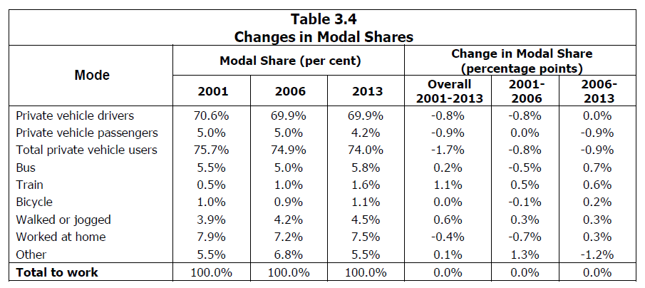
As you can see the changes are something not to be really proud of. Still nothing to write off yet as we still have the last bits coming through for public transport BEFORE we get to the City Rail Link question.
Some further figures at the breakdown

Finally in comparison to our Australian cousins (as we compete with them)
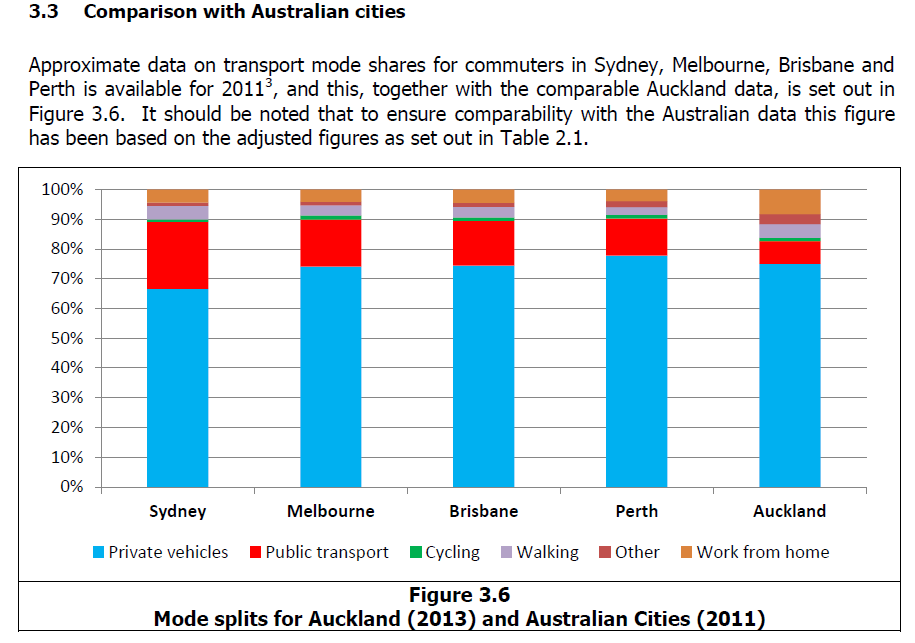
The report noted:
The key points which emerge from the comparison between the results for Auckland and those for the Australian cities are:-
A low use of public transport, with a share that is lower than that for Perth and is half that of Melbourne and Brisbane and a third of that of Sydney.
A high proportion of people working at home.
A fairly high proportion of walking trips which are higher than all the other cities except Sydney.
Private vehicle use that is broadly in line with that for Melbourne and Brisbane, is above that for Sydney, and is below that for Perth.
Concluding Remarks
First of all the overall travel patterns should not be used to give rise sweeping policy reactions on our transportation system, planning and investment. You need to see the breakdown by centre (so City Centre and the major employment and resident centres) to workout what is really going on and how our planning/investment should still be targeted. That said while the mode share has not really shifted we still have a range of public transport investment coming through the pipeline (that does not include the City Rail Link). I have made mention to what those investments were (AT-HOP, electric trains, integrated fares etc) and we should wait until they are fully on stream before any policy changes in transport investment especially before the City Rail Link starts construction. The next Census is 2018 with analysis at the level of the Ministry of Transport’s commissioned paper not due until 2019 it does conflict with a CRL start date of 2016, 2017 and even 2018. However, other data such at AT-HOP data and NZTA motorway traffic counting should be able to assist in the interim.
All-in-all though the stubborn refusal in a larger scale mode shift towards public transport away from private transport is enough for concern especially as we continue to implement the Auckland Plan. However, again I do mention that we need to look at the breakdown by centres. For example public transport mode share increased while private mode decreased around the lower and mid North Shore. This is due to the Bus-Way being opened and successful. While in Highbrook and the Airport complex private transport share increased.
The next post I will look at commuting patterns to the City Centre. Where do the people come from and how do they get there? And what surprises did the analysis show? Coming up on Talking Auckland.

