
Part Two in “A look at who commutes to the Major non City Centre Employment Centres and where from”
Source: Supplied
I am running a series of posts on Auckland’s commuting journeys from home to the work place and back again. The information on Auckland’s commuting journeys is based on the Ministry of Transport commissioned paper done by Richard Paling. You can see the full paper here which based its statistical analysis on the 2001, 2006 and 2013 Censuses: http://www.scribd.com/doc/236566739/Richard-Paling-Report-Transport-Patterns-in-the-Auckland-Region . I do point out those as the material is bases on the Censuses we have limitations insofar as students commuting to and from tertiary institutions were not counted (so some 125,000 students across the institutions at the minimum). So we must bear this in mind when doing out analysis interpretations. An example of this is the Eastern and Southern Rail Lines and who takes them. More on this when I get to the City Centre part of the series.+
| Table B.1 Growth in Population of the Auckland Region 2001-2013 | |||||||||
| Area | Total Resident Population | Total Growth | |||||||
| 2001 | 2006 | 2013 | 2001-2006 | 2006-2013 | |||||
| Total Region | |||||||||
| Total Auckland exc CBD | 1,150,101 | 1,283,598 | 1,384,212 | 11.6% | 7.8% | ||||
| Individual Former Cities or Districts Potentially Impacted by Rail | |||||||||
| Waitakere | 169,569 | 187,281 | 200,826 | 10.4% | 7.2% | ||||
| Auckland City exc CBD | 349,275 | 374,631 | 395,772 | 7.3% | 5.6% | ||||
| Manukau, Papakura & Franklin | 362,478 | 418,446 | 453,378 | 15.4% | 8.3% | ||||
| Combined Areas | 881,322 | 980,358 | 1,049,976 | 11.2% | 7.1% | ||||
A quick recap can be seen at “A First Look at “Journey to Work Patterns in the Auckland Region”” in regard to the transport paper.
—————————————————————————————————
Commuting To and From Major Employment Centres outside of the City Centre – Part 2
In the last series post I looked at commuting patterns to and from some of the major employment centres outside of the City Centre. In this series post I take a look at more of our big employment centres to the north of the City Centre as well as the Airport Complex. Unlike the previous series post which has employment centres that had large industrial complexes either within or near them, these particular employment centres (apart from the Airport) do not have these heavy industrial complexes near them. They are primarily commercial (or commercial/residential) centres.
The Centres I am looking at in this post:
- North Harbour (Albany)
- Takapuna/Westlake
- The Airport
Again I am doing an overview of the commuting trends from the above mentioned centres. I am aware Council has been discussing and endorsing the “Integrated business precinct plan: industrial south Auckland” at the Economic Development Committee yesterday. I will come to that particular agenda item once I have covered the other Centres from the research paper.
The Richard Paling Report Transport Patterns in the Auckland Region took a look at the major employment centres outside of the main City Centre. Depending on where the Centre was located and its proximity to transport infrastructure was how far of a catchment that particular Centre drew its workers from
North Harbour, and Takapuna/Westgate
I will look at both North Shore locations as they show similar commuting trends. That is the bulk come from the North Shore and Rodney with very little coming in else where.
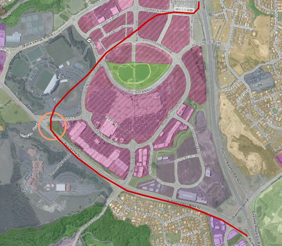
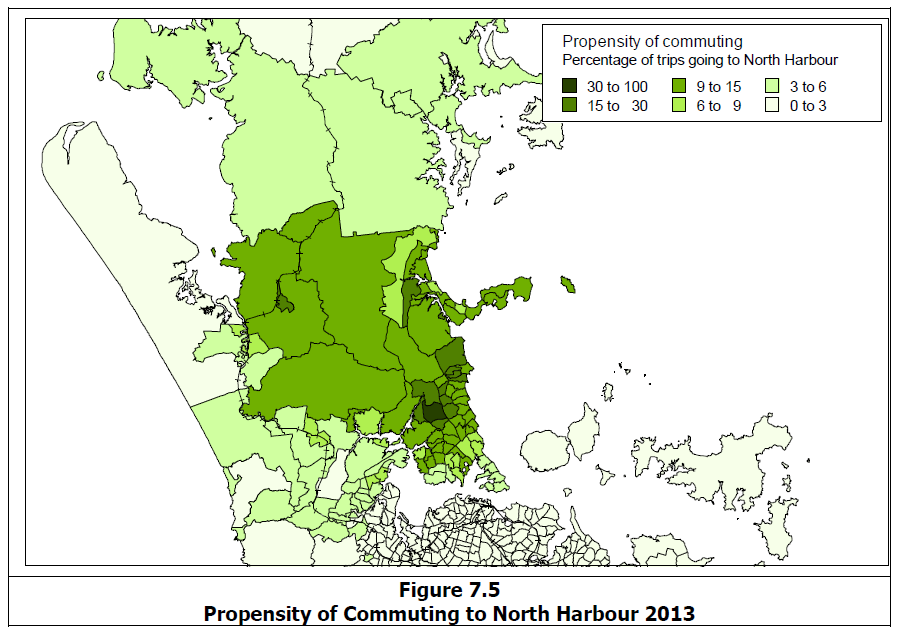
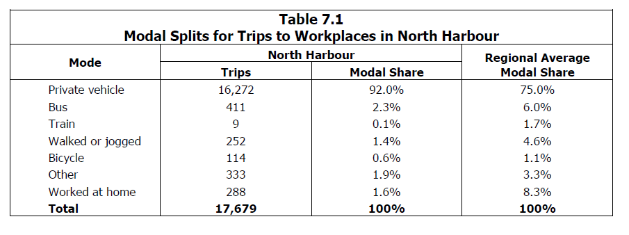
North Harbour Catchment and Mode Share which attracts 18,000 commuters
The paper noted:
For the North Harbour estate, commuting is mainly from areas to the north and west and a limited band to the south. Longer distance commuting flows from the south and south-west in the direction away from the central area are relatively small.
And’
Trip making into the area is characterised by very high private vehicle use and low public transport and active mode use. The average trip distance is 15.7 kms, about 35 per cent higher than the regional average of 11.8 kms. This is a reflection of the relatively large catchment area, particularly to the north of the Estate.
I’ll post up Takapuna/Westgate next then comment on the North Shore commuting trends.
Takapuna/Westlake Catchment and Mode Share which attracts around 15,000 commuters


The paper commented:
The area has a relatively high private vehicle share of commuting trips and also has a bus share that is higher than the regional average reflecting in part the Northern Busway which directly serves parts of the area, particularly Westlake and Smales Farm. The share of active mode trips is slightly below with the regional average. The average trip length for commuting trips to the area is 12.9 kms, about 10 per cent higher than the regional average.
Both Takapuna and North Harbour have Metropolitan Centres within them. Them being the Takapuna Metropolitan Centre, and the Albany Metropolitan Centre. But despite the North Shore having two Metropolitan Centres you can see some start differences in commuting patterns and catchments.
Takapuna mainly draws in from the urban North Shore while North Harbour has quite a large rural catchment. Takapuna is well served by buses and the Busway and it shows up on its mode share for buses which is higher than the regional average. North Harbour despite being served by the Northern Express buses has a high private transport mode share count and a lower than average public transport mode share count. This could stem from North Harbour’s large rural catchment as well as its planning regime which is more pro car in its layout than people. North Harbour is relatively young (about as old as Botany) and so the planning regime then (the 1990’s) was around decentralisation, low density sprawl and the car. Takapuna would serve as a good comparison in how to get the ball rolling in making North Harbour a more people friendly place that has better public transport systems than now. That said you will still get a higher private mode share with the large rural catchment such as North Harbour has.
The Airport
The Airport catchment is both the Airport itself as well as the industrial complex that straddles State Highway 20B that runs in a northerly direction towards State Highway 20 (SH20A is the City-Airport link where as SH20B is the Manukau/South – Airport Link). The catchment area has around 13,000 commute journeys. Note: the Paper does not cover freight journeys nor journeys to the airport complex outside of the standard commute to work definition.
The Airport Catchment

The Airport’s worker catchment is mainly from Southern Auckland and to a limited extend the northern flanks of the Manukau Harbour. What the upcoming mode share will show is that we have a long way to go before public transport is decent enough to serve the Airport complex.
The Airport’s Mode Share

The Paper noted:
As in the case of Highbrook, the area has a very high share of trips by private vehicles which account for almost 93 per cent of all commuting trips. The public transport share is low at about 2 per cent, reflecting the limited services offered and the nature and geographical distribution of employment in the area with a high proportion of shift working and the dispersed nature of the sites away from public transport routes. There are also relatively small numbers of active mode trips, again reflecting the size of the area and the remoteness of much of the employment from residential areas.
The average trip distance is 18.1 kms, substantially above the regional average. Again, this reflects the wide area from which workers are drawn and the size of the area itself which means that even journeys from neighbouring locations are relatively long.
The Airport Line (extension of the Onehunga Line to the Airport allowing train services from the Airport to Britomart) and either a regular bus services along State Highway 20B to Manukau and then out to Botany or the Botany Line Sky Train concept will go some way in improving the public transport mode share to and from the Airport complex. But the services will need to be every 15 minutes for when the airport is operating to be of any use. However owing to the dispersed nature of the Airport and the surrounding industrial complex public transport will be limited into serving key areas of the complex leaving out larger potions of the area. As a result commuter trips to the Airport complex would remain in favour of the car. HOWEVER, a well grounded public transport system to the Airport complex would serve airport travellers better than what they have got now.
Where Next
This bring a close of the coverage looking at the employment centres both at the City Centre and outside the City Centre. Next up I will take a look at the major residential centres listed in the research paper. These residential centres include:
Orewa
Westlake/Takapuna
Albany (including the CAUs of Fairview and Northcross)
Henderson
New Lynn, including Lynnmall and Fruitvale
Westgate
Stonefields
Newmarket
Dannemora (including Kilkenny, Point View and Baverstock Oaks)
Some of these have been covered in the employment centres part of this series.
A quick snippet at what the residential centres analysis came up with
Trip Patterns for Selected Residential Locations
Key Findings
For the newer residential areas of Westgate, Stonefields and Dannemora/Flatbush, the private car share for trips by residents of the area is relatively high at between 83 and 86 per cent, compared to the regional average of 75 per cent. Despite having an inner urban location, Stonefields has a private transport share that is higher than surrounding areas and is characteristic of development areas on the periphery of the urban area. The bus share is higher than the regional average at Westlake/Takapuna, Albany and Newmarket.
The rail share is relatively high at Newmarket, New Lynn and Stonefields although for the last the overall public transport share is low
In general between 2006 and 2013, the private vehicle mode share has declined in most areas, although there were increases for Henderson, New Lynn, Stonefields and Dannemora/Flat Bush.
Bus shares have generally increased except for Westgate and New Lynn where these have probably been reduced because of a switch to rail.
Changes in the numbers of active trips have varied with no clear pattern.
In total these accounted for about 26,000 commuting trips, around 5 per cent of the total. Because of the ways in which CAUs are defined they typically have a similar resident population (and workforce) and do not individually capture large resident populations.
Richard Paling Report Transport Patterns in the Auckland Region

